

Just some infographics, briefed with what I think about them as a group. These images have no particular order, but they are grouped by theme. For example, images with a focus on finance will stick with finance.
This will slowly amass over the years.
OPERATION UNFALLEN BABEL:
China can draw on a talent pool of 1.3 billion people, but the United States can draw on a talent pool of 7 billion…
Lee Kuan Yew
[1]
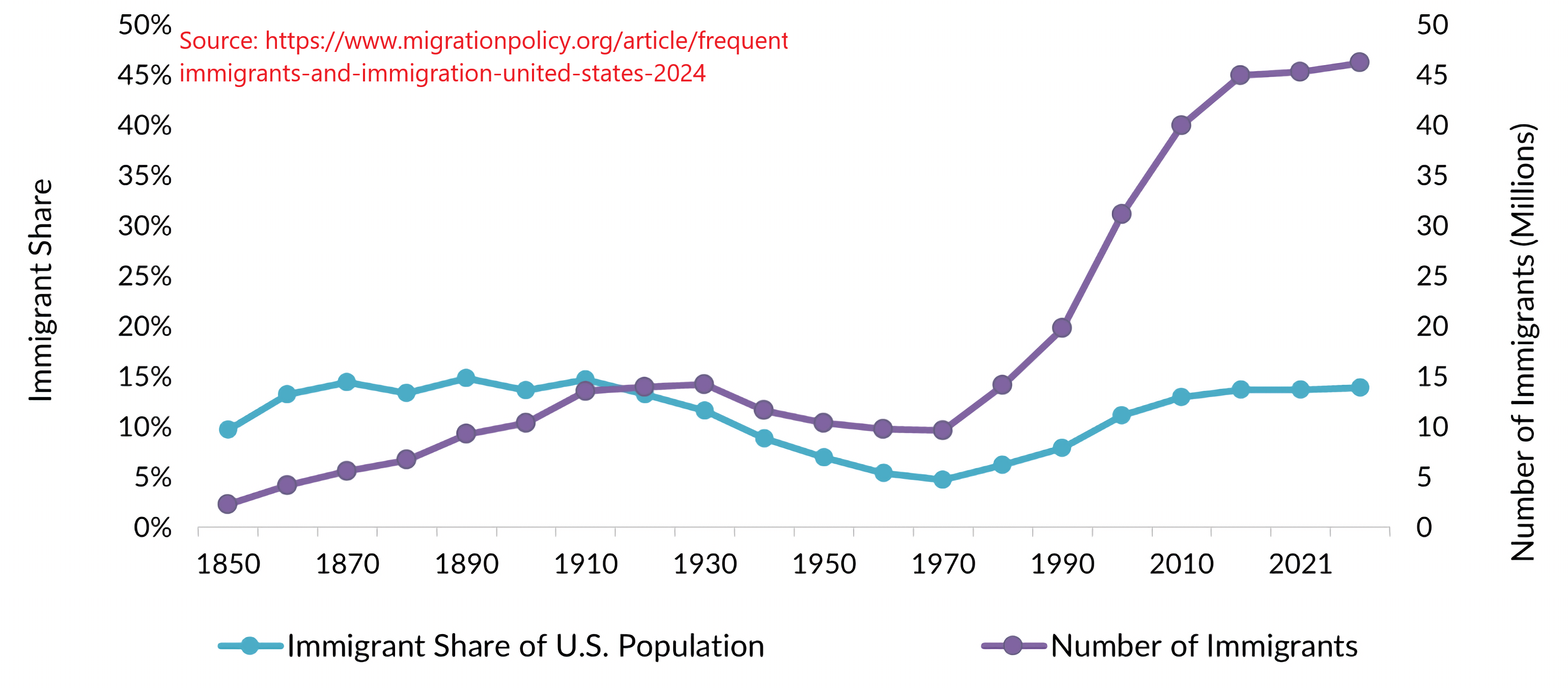
- The graph above is measuring *living* immigrants at that moment of time. For example, in 1850, 2.2 million immigrants were living in the US. In 2022, 46.2 million immigrants live in the US.
- Interestingly, the peak % share of immigrants peaked in 1890, representing 14.8% of the population. At 2022, immigrants represent 13.9% of the total living US population.
- The lowest share of immigrant population were in the 1970s, with 9.6 million immigrants representing 4.7% of living US population.
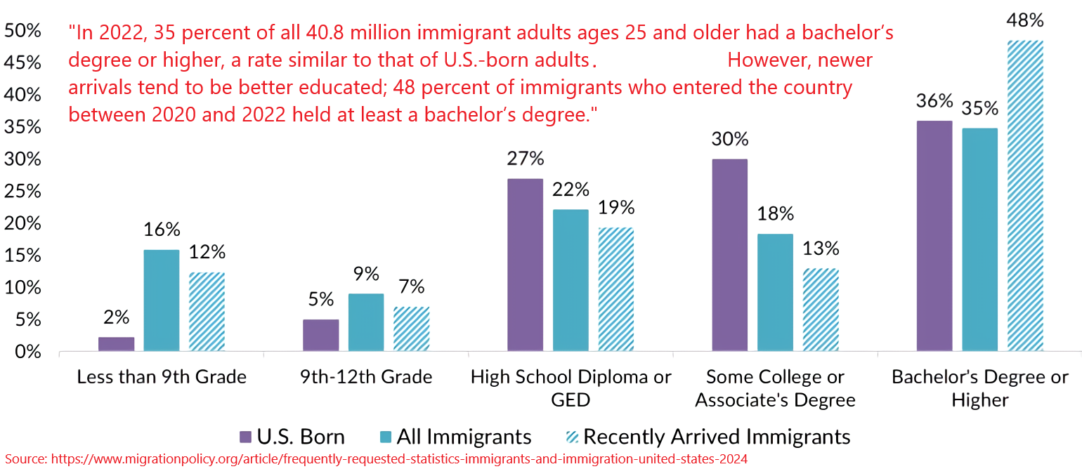
- This graph is actually pretty impressive: regarding higher education, immigrants slightly outnumber native-born Americans. Of course, you would have to question the quality of each university abroad in comparison to US universities. After all, US universities are sought all over the world. Though, with the internet, I would not be surprised if the quality of universities abroad will match the quality of universities in the US. And that’s because extremely talented people post their findings online. In fact, Harvard, MIT, and Stanford already publish some of their courses online, though, you won’t get a degree because you have to be an actual student in their faculties.
- The “Recently Arrived Immigrants” are immigrants that moved to the US between the years 2020-2022. I would not be surprised that the large jump of % of immigrants with a Bachelor’s degree or higher is due to a large number of people in the world locked up in their homes, in which case, universities had to adapt their means of educating their students. Universities probably laxed their requirements.
[2]
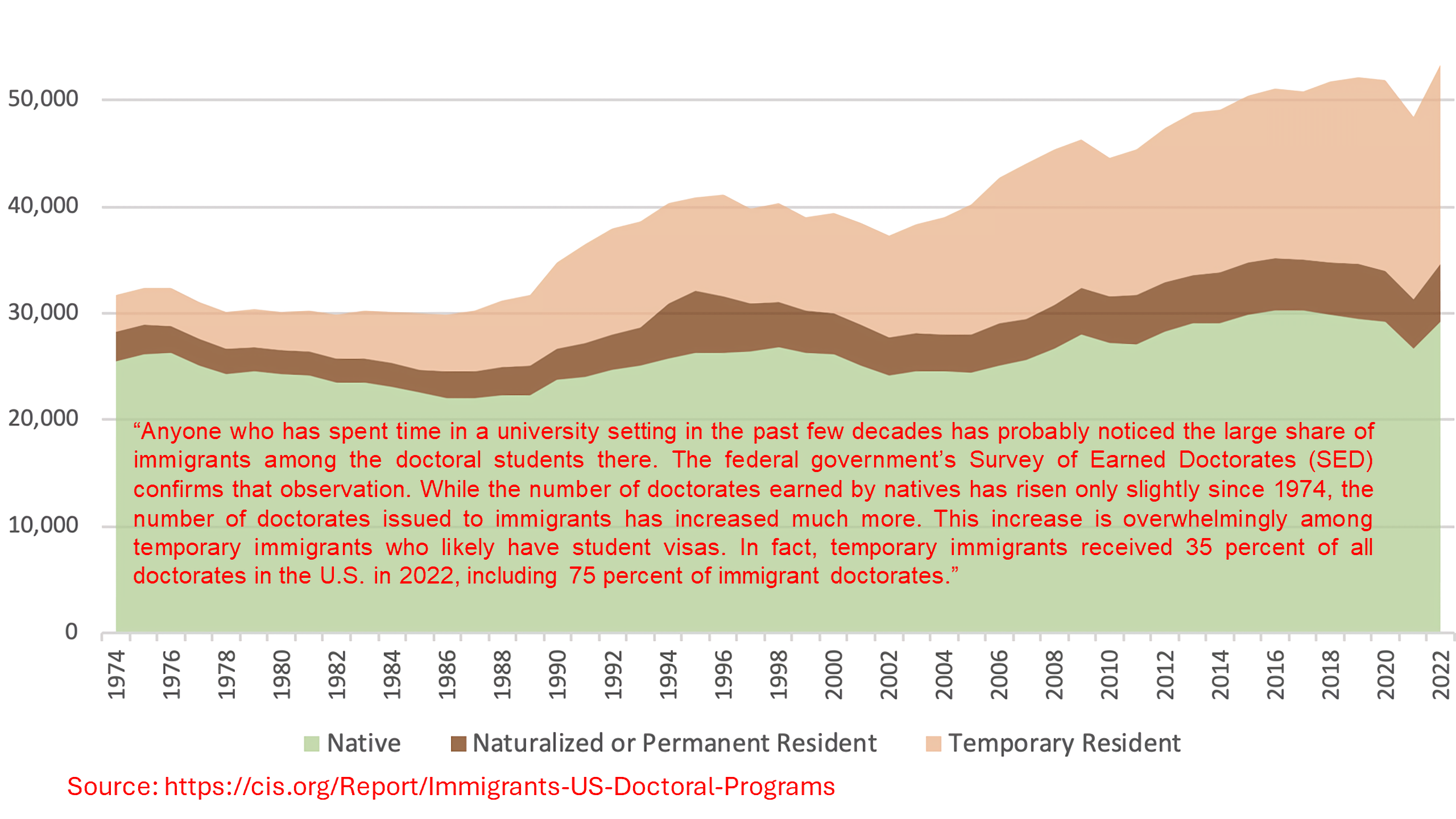
- This graph is also pretty impressive: immigrants outnumber native-born Americans regarding PhDs. Even more impressive: temporary residents received **35%** of all US Doctorates. The question for policy makers is the following: what policies will keep such individuals?
- It’s hard to say what policies will keep temporary residents as such policies may scare residents away via overcommitting to the US. Likely, temporary residents are temporary because they are probably playing the optionality game: “If I have a PhD, I could work in any country and command a higher premium,” or something like that.
- The golden wing, I suspect, is that US policy makers, if they wish to keep talented individuals in the US, is to make the US the best place to live in the world.
- I could see a positive feedback loop emerging: by keeping talented people in the US, not through force but through soft cultural power, talented people will use their talents to further improve the standard of living in the US.
[3]
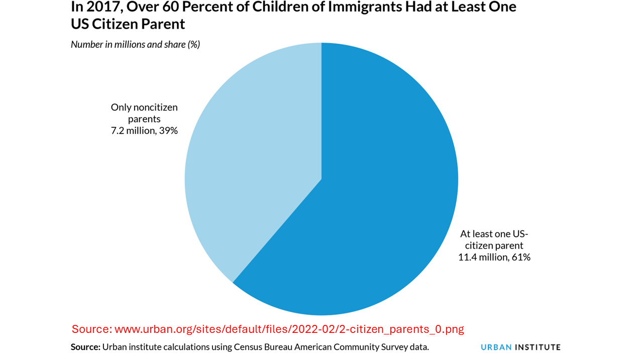
- What interests me with this graph above is particularly the “At least one US-citizen parent” aspect. If we consider the previous graphs with the Bachelor’s degrees and PhDs, what are the odds that those same immigrants are starting families in the US?
- I suspect, from a US national security strategy POV, that is an excellent thing: not only has another country lost their talent (from the global competition of other powerful countries), that same country also lost their *future* **generations** of talent.
[4]
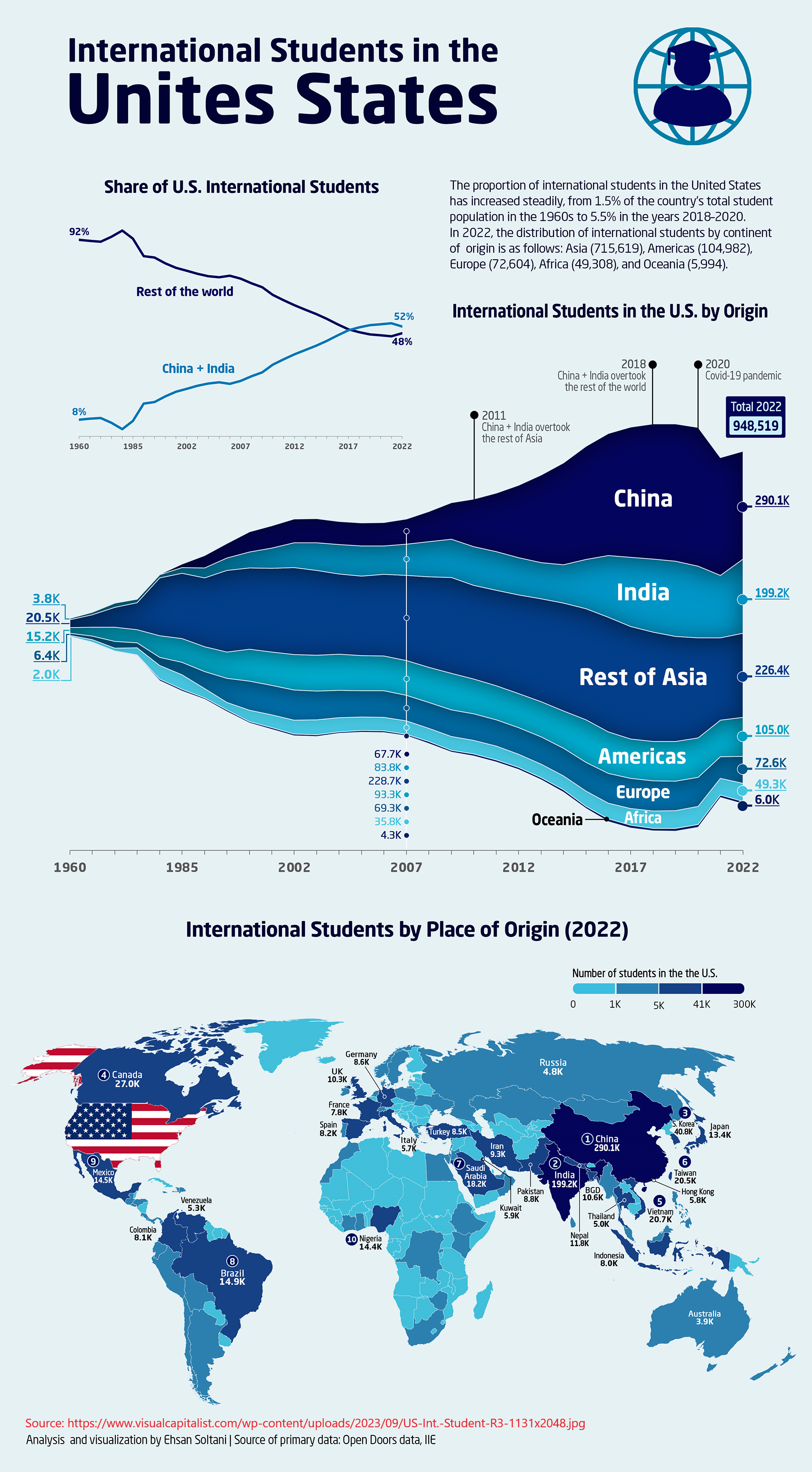
- What makes this graph interesting is that 52% of international students studying in the US comes from China and India, both countries with over a billion people residing in respective borders.
- What is more interesting to me is actually how small of a number of international students studying in the US: only 948k students as of 2022.
Some things to figure out…
- What mother countries are immigrants coming from?
- In regard to LKY’s quote about the US drawing talent from 7 billion people in the world, so far, the US is simultaneously doing a great and terrible job. Great, because the US is the number one importer of talent. Terrible, because… bare with me with my (shoddy) logic here.
- While IQ is not an accurate measure of intelligence (because intelligence is non-linear and operates on fat-tailed distributions, not Gaussian distributions), supposing the goal of the US is to bring home the top 14% of the curve, the US is doing a terrible job because it’s no where CLOSE to doing so.
- What countries have the most international students?
- How many first-generation families are starting families in the US (also known as second-generation immigrant families)? I think that is important because it would show that some immigrants are choosing to live in the US for quite some time. It is also probably a measure of the standard of living of the US—are people willing to take the gamble to live in the US?
- What portion of immigrants believe in the American Dream? What portion of native-born Americans believe in the American Dream?
- I suspect that a large % of immigrants believe that the American Dream is real, while that a large number of native-born Americans do not believe or no longer believe that the American Dream is real. Anecdotally speaking: it is a bit interesting to note that, growing up, a lot of my peers do not believe in the American Dream (and that is is more of an American Hoax!), while working at my first job and talking with some immigrants would say that the American Dream is real (“I could buy food for my family!”).
Population and some guesses
[1]
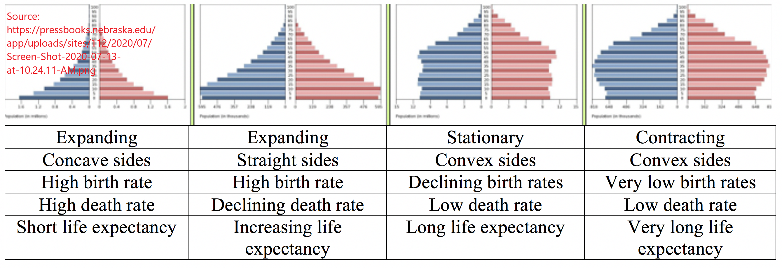
- These are just the generic shapes of population pyramids. It seems as though the ideal population pyramid is the second expansion type: the one with high birth rates, declining death rates, and increasing life expectancy. The population pyramid that has a lot of bad news is probably the fourth population pyramid because that represents a country in demographic decline.
[2]
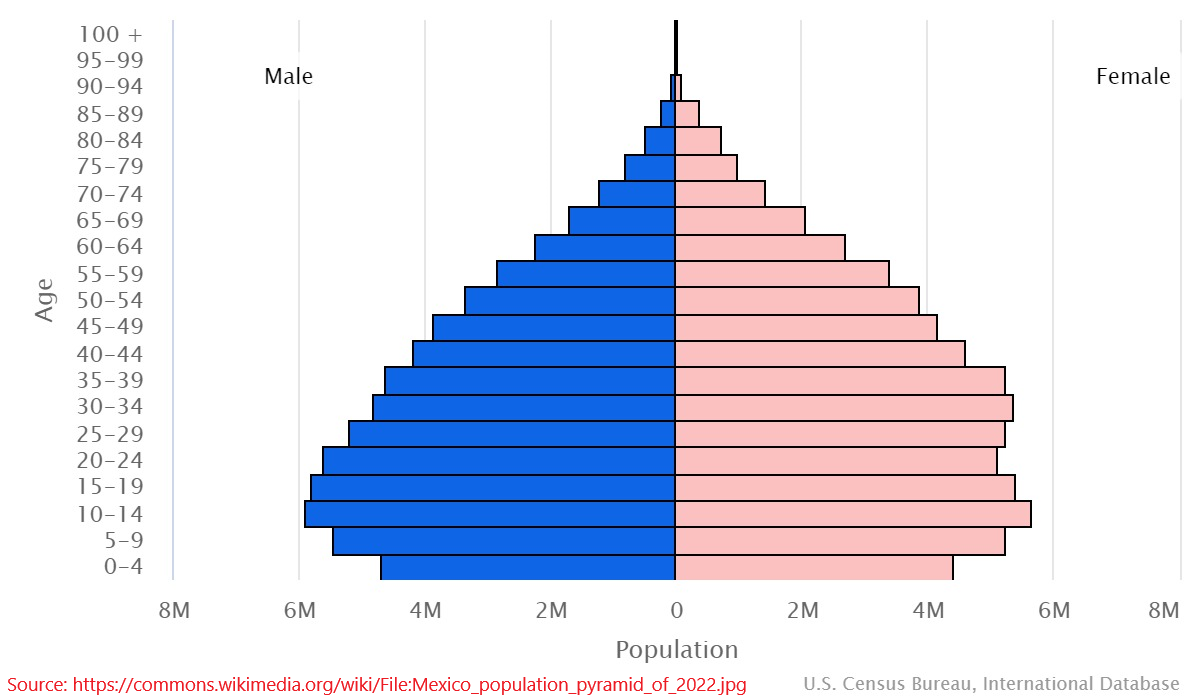
- With Mexico’s population pyramid, we could probably say that its demographics is pretty healthy.
[3]
.jpg)
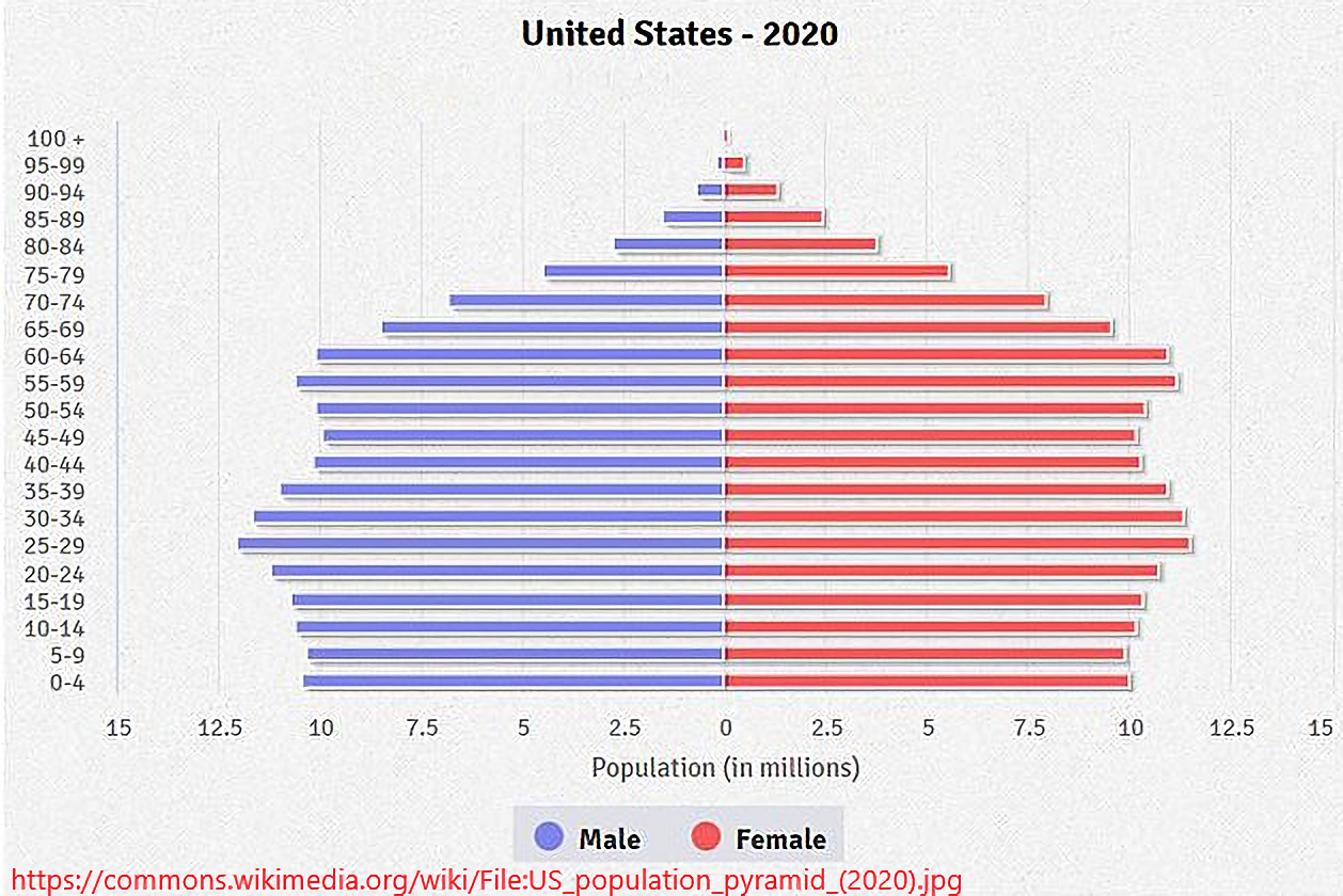
- Is the US sustaining its birth rate? Or is the US on the verge of a contracting population?
- If *sustaining*, how do you increase the birth rate? And if *contracting* not only how do you increase the birth rate, but how do you prepare for a multidecadal slowing of the economy (because of the lack of consumer capital and labor)?
[4]
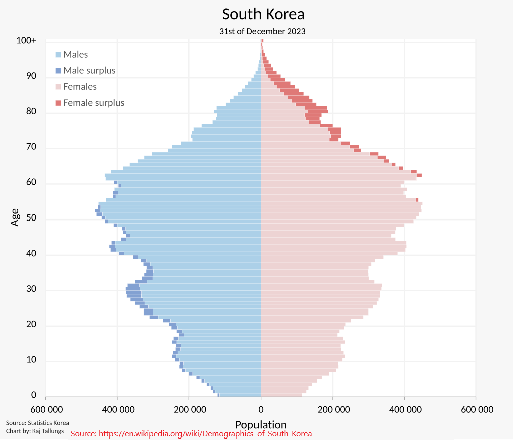
- (From now on, I’ll be using population pyramids that reveal surpluses because that might just make predicting things somewhat easier)
- What’s interesting about the South Korean population pyramid is that this particular graph shows male surpluses extending all the way through age 60. From age 60 and beyond, you could find female surpluses.
- What could we infer about these gender surpluses?
- Could gender surpluses reveal a partial explanation for an increase of loneliness in general?
- I wouldn’t be surprised if a surplus of males, especially between 20-40, means a more competitive dating pool against their peers. If there were a surplus of females in the same age bracket, we could say that females would also face a more competitive dating pool against their peers.
- In the cases of war where countries send their young men to fight, we would probably see a reversal—between 20-40, male shortages, which implies female surpluses at the same age bracket. And the longer the war, the longer these male shortages and female surpluses are drawn out.
- Could gender surpluses reveal a partial explanation for an increase of loneliness in general?
- What could we infer about these gender surpluses?
Further guesses into population
- How does the declining population pyramid effect the economics of that country? I ask this question because when people start retiring, who will take the work?—there is not enough people to move along the chain of population. My guess is that robots will fill those gaps.
- Once those gaps are filled, how long will it take for that country to return to an expanding population pyramid? And would the end of WW2 be a model (because soldiers came home and started families)?
- Would a declining population pyramid reveal a declining economy over a long enough time scale?
- The point of increasing birth rates, from a national strategy perspective, is about increasing the number of geniuses at any moment of time. If geniuses represent 1% of a country’s population, then it is better to have 1% of 1 billion (10,000,000) people as geniuses than it is to have 1% of 10 million (100,00) people.
- Regarding that point, is it possible to guess where there will be an increasing number of geniuses over the course of the decades? For example, if we take a look at Mexico’s population pyramid, it might just be reasonable to say that we would see an increase of number of geniuses born in Mexico. Similarly, when we take a look at Japan’s population pyramid or South Korea’s population pyramid, we could say that we would see a decreasing number of geniuses born in their respective countries.
- And just regarding large populations in general, it would not surprise me if we see a large number of geniuses already born in India and China because both countries have over a billion people within their respective borders.
- In general, why are there so many, between 20-40, male surpluses? Similarly, why are there so many, between 60-100, female surpluses? What causes this phenomenon?
- Is it possible to reason that if there were female surpluses, between 20-40, we would see a population boom? It is possible, but social norms make that harder to happen, namely one-to-one marriages.
- How much of gender surpluses are related to diseases and illness? What about geographic?—by which I mean the friction of meeting people?